Customer Communication Psychology: How Perception Shapes Every Message
When an organization sends a piece of customer communication, its purpose is to deliver information. However, it is so much more when your customer receives it. It triggers a cascade of psychological responses that determine whether or not your message lands or goes over their head.
Key Takeaways:
● Any communication results in an emotional judgement even before customers read the actual content. Perception and presentation directly influence whether they skim through the content or ignore it.
● Cognitive overload is due to dense layouts, long paragraphs, and heavy visuals, which increase anxiety. Whitespace and clear structuring with proper hierarchy show clarity and transparency.
● The F-shaped reading patterns mean the first lines, left-side content, and highlighting CTAs carry weight. Openings must be concise, relevant, and immediately address readers’ pain points.
● Formats like PDFs, HTML pages, and printed letters signify different psychological effects. The right kind of medium should be chosen to match the goal of the communication.
● Structure, tone, and design choices act as micro-signals that either work with or go against your messaging goals.
This fine line between getting ignored and reaching your customer is more critical than most organizations realize. Marketers and product teams spend hours crafting the perfect message, refining the copy, and finally putting it all together. Research shows that customers make emotional decisions about communications, often before they read a single word of your copy. The content itself might be excellent, but presentation matters. Even if the fonts, colors, UI elements, frequency of communication, tone, and everything else are some elements that shape your audience’s perception. By extension, it also shapes the perception of your content.
The good news is that these signals aren’t random. They are predictable, measurable, and entirely within your control.
The White Space Principle: A Visual Tool That Guides Attention, Reduces Stress, And Improves Comprehension.
Let’s look at two emails side-by-side: one is a dense email, every inch filled with text, links, CTAs, visuals, and more, crammed together. Second, spacious with generous margins, breathing space between headings and sections, and active and passive whitespace that guide user attention and improve layout.
Which one feels safer?
The first question one might think if they look at the first email is, “Why is all this information squeezed together? Are they trying to hide something by overloading me with information? Is it this hard to understand?” This is because of a simple concept called cognitive overload that triggers skepticism. Our brains are designed to interpret density as a sign of complexity.
White Space, on the other hand, signals clarity. The white space isn’t a waste of space; rather, it makes it easier for customers to process information and engage with the content.
This isn’t an aesthetic preference; it’s neuroscience. Let’s take Apple’s minimalistic interface design, which uses whitespace for this exact reason. Another noteworthy example is Google’s homepage, take even the search engine? So much white space.
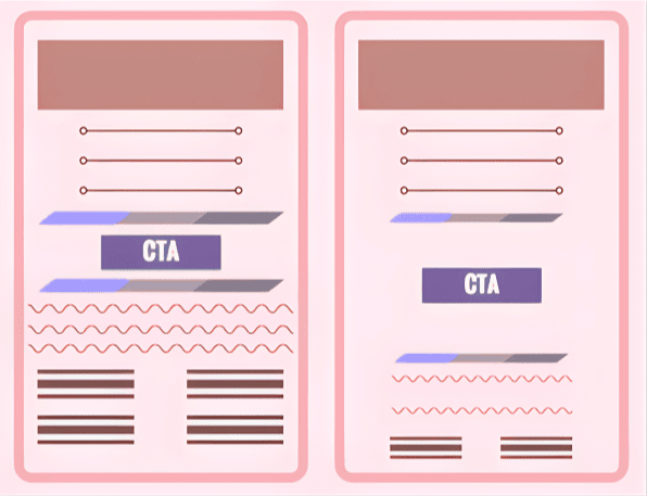
For customer communications: the goal is to reduce anxiety. How do you do this? Add space. Something as simple as a design choice can determine how safe your customer feels engaging with your message.
The First Three Lines Approach: F-Patterned Thinking
Organizations assume that customers read everything. That’s completely untrue, especially for marketing content. Eye-tracking research from Nielsen Norman Group recognized that users read in a horizontal movement, which usually covers the upper area. As they go down, they only read the content on the left side in a vertically downward movement.
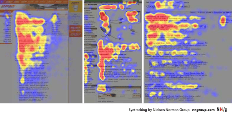
This research shows that the first few lines of any piece of content receive significantly more attention than what follows. If your opening doesn’t immediately capture a customer’s attention, all the valuable information buried in your text will never be read.
In such a fast-paced era where customers only skim and scan content, you need an opening that creates an engagement opportunity. You need to:
● Establish immediate relevance to the reader’s pain points.
● Answer the question: Why does this matter to me?
● Be concise enough to be absorbed in a quick scan.
Consider a product sending out an update email
A weak opening: We’re excited to announce that your favorite automation platform has been upgraded with several new features that can improve your workflow and make your job easier.
An impactful opening: Your workflow just got updated–Five new features to make it quicker and easier.
The difference is subtle, but the psychological impact is significant. The first opening might seem more polite and informational, but it’s too lengthy. The second one is concise, shorter, and feels relevant.
Read our in-depth analysis of the top ten document generation tools in 2025!
Format as Psychology
We’ve been hearing about omnichannel communication in the past few years, but did you know that the same message delivered in different formats triggers different emotional responses from customers?
A PDF is perceived as official communication. It carries weight. It is considered essential and authoritative. When a customer receives a PDF, the first thought is, “This is worth paying attention to.”
HTML or a webpage feels lighter, conversational, and more accessible. Customers can refer to it immediately, always return to the webpage, or use a different device, and the HTML content is responsive.
A printed letter signals personal attention, immediacy, importance, and tradition.
Research has shown that CTR for case studies found that users clicked on HTML versions 55% of the time compared to 45% for PDF versions. The actual content was identical, but format shaped the perception. Here’s a quote from one of the participants: “It seems to be a page in the site and not a PDF document. I prefer to read case studies on a responsive page rather than on a PDF”.
Of course, this doesn’t mean abandon PDFs. It just means being more aware of what format can actually help you achieve your goal. Are you asking your customer to take immediate actions? Are you looking at establishing authority or permanence?
The communication choice shapes the perception before customers even read the content inside the communication. Formats aren’t neutral; make more informed choices in what you send out.
Structure Communicates Intent: The goal is to reduce anxiety.
A properly structured message is not just good design practice but also aligns with psychology. Clear structuring reduces anxiety. If a customer’s brain has to work harder to extract information from your copy, it causes cognitive friction. Friction leads to hesitation, hesitation leads to delay, sometimes complete abandonment.
Consider Three Design Elements:
Headings function as anchors that tell readers what’s coming and why it matters. Headings guide readers, and sub-headings improve comprehension. Simply put, these help people navigate information, helping customers understand the full content.
Short Paragraphs feel manageable. Imagine reading a dense paragraph of 300 words vs. reading the same content split into three different paragraphs of 70 words each. The information density is the same, but requires lower activation energy, giving our brain the perception that this is easier.
Visual Hierarchy guides attention and signals importance. A good design doesn’t just improve readability, but highlights the most prominent information. It reduces decision fatigue by telling readers what can be ignored and which elements are important. This takes the load off the brain, and the design handles the cognitive work for you.
These are conscious choices that result in a permission structure. Instead of explicitly telling a customer Here’s what matters. Here’s what you can skip. Here’s where you need to take action. They implicitly convey the same ideas.
The Signals Behind Every Design Choice
Every design choice is a signal, a tiny micro-communication that occurs before the actual message, heavily rooted in psychology.
Let me give you a few examples:
Is your email template responsive? Does it look garbled on a mobile phone? This sends a signal that you’ve put in effort and built this with customer experience in mind.
Do you use active voice and direct address or passive, impersonal language? This signals approachability, personality, and directness.
Does your CTA stand out visually, or does it blend with the rest of the page? This signals confidence.
Organizations need to understand that you’re not just crafting communications, you’re engineering them with your customers in mind. It is crucial to recognize that every space, every formatting choice, every word selection, and every placement of CTAs are all micro-signals that either reinforce the message you are sending or negate it.
Shift Your Perception Of Conveying Information Into Providing An Experience:
The idea isn’t information delivery, it’s about perception management. Transparent communication strengthens customer confidence, increases response times, and builds trust. At the same time, it only works with the proper format, structure, and presentation that reinforce those values.
An organization can’t claim to value simplicity and send out cramped, structurally confusing documents. Building lasting customer relationships through communications is about understanding perception and answering the unspoken questions subtly: Is this important? Is this safe? Do I need to act now?
Your message becomes more effective if you can get it right at a psychological level. Customers don’t just read your message. They feel the care and thought behind it. They notice the confidence and clarity in your words.
That’s precisely the feeling experience provides.
Check out Perfect Doc Studio, a business user-friendly tool that helps you design documents, emails, messages, and more with a few clicks. SIGN UP FOR THE LIFETIME FREEMIUM ACCOUNT AND TRY IT TODAY!
FAQs
Customer communication psychology explains how layout, formatting, tone, and channel shape how customers feel about a message before they consciously process the content. When brands design communications with cognitive load, visual hierarchy, and emotional responses in mind, engagement, trust, and action rates improve across email, PDF, print, and web formats.
Cognitive overload occurs when a message feels visually dense or poorly structured, forcing the brain to work too hard to find what matters. Long, unbroken paragraphs, cramped layouts, and competing visual elements often trigger skepticism and stress, pushing customers to skim, delay, or abandon the communication.
White space signals clarity and safety by giving the eye rest, separating sections, and guiding attention to what matters most.In emails, letters, PDFs, and webpages, generous margins, line spacing, and breathing room between blocks reduce anxiety and make information easier to scan and act on.
The F-shaped reading pattern describes how users typically scan screens: two horizontal sweeps near the top followed by a vertical scan down the left side.This pattern means the first lines and left-aligned content carry disproportionate weight, so subject lines, opening sentences, and early CTAs must work harder to capture attention.
Yes, format acts as a psychological cue: PDFs often feel official and permanent, HTML pages feel lighter and more interactive, and print letters feel personal and serious. Even when content is identical, users may trust, prioritise, or act on it differently depending on whether it appears as a downloadable document, a responsive page, or a physical letter.
Businesses can reduce anxiety by combining clear structure (headings, short paragraphs, visual hierarchy) with thoughtful format choices that match the goal of the message. Aligning tone, layout, and channel with promised brand values—such as simplicity, transparency, or reliability—creates a felt sense of safety that makes customers more willing to respond.

Must-Have Legal Document Generation Software in 2025
This blog offers a comprehensive look at the top legal document generator software for 2025. We look

The Complete Guide to Insurance Customer Communication Management (CCM) in 2025
This blog examines the vital role of Insurance Customer Communication Management (CCM) in enhancing
Explore the Highly- Rated Insurance Quoting Software for Effective Policy Management
The blog explores the need for specialized insurance quoting software and its various benefits, and