Mobile Email Design Best Practices And Examples
Email is an essential source of communication for businesses. Earlier, emails were an important medium for people to get in touch. Later, the advancement in technology enabled users to use other reliable sources, such as messaging apps, network chat, and many more. Therefore, communication via email became the communication source for businesses and enterprises.
It is when email marketing originated and led to a revolution in the marketing industry. Since marketing is the backbone of success for any business, email holds critical importance. Presently, businesses and freelancers use email marketing in different ways to get leads and conversions.
The entire process of email marketing is wonderful, lucrative, and highly beneficial. The pitfall is that you must use tactics to optimize your emails and get the desired outcomes. Thus, responsive mobile-first email designs are the key concept to explore. The reason is that almost every individual, today, carries a smartphone, making it the typical form of an email reading gadget.
We have realized the importance of responsive email designs and emails that can generate leads. So, this article is the ultimate guide for every detail about mobile-first email designs. The details include effective practices for a lucrative email design. We will shed light on a few examples that follow the rules in the best way. Let’s roll in:
Mobile Email Design-Overview
Before we jump straight into the explanation of mobile-first or simply mobile email design, it is necessary to go through the brief breakthroughs in email marketing form.
Evolution Of Email Marketing
Initially, when the smartphone did not make it into every individual’s pocket, a desktop computer was the email reader. People use PC or desktop computers to design, send, and view emails. Whether the emails were academic, corporate, promotional, or any form of campaign, the email design and marketing process were through a computer.
Meanwhile, computers remain an essential source of email marketing; their use is no longer as common as it used to be. Many other email creation and reading sources hit the market, including operating systems like
Windows, Linux, macOS, etc. Thus, email marketers thought of ways to optimize their emails for users who view the email in their respective operating systems.
Currently, the mobile phone is the commonly used tech gadget with access to almost every individual. Mobile phone differs from desktop computers such as display, operating system, process, etc. The need for optimization of emails became an immense need.
Therefore, we must optimize our emails to make them readable on mobile phones and other devices. Let’s examine mobile email design and its
Mobile-First Email Design
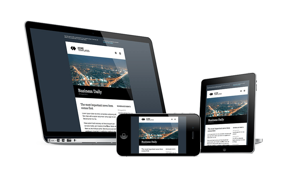
As you read about the mobile display, you understand it is comparatively smaller than a computer, laptop, or any other device. So, when you design an email that works best for a computer, how can it fit the small display of the mobile phone? It will alter the email content, like images, links, and the overall format of the email.
It is where mobile-first email design comes in handy. In mobile-first or mobile-friendly emails, we design the content of the email with the mobile attributes in mind. The primary reading device for mobile-first email is a smartphone. Then, it can work on any other device, especially when you design multiple versions of the same email for such devices.
The mobile-first emails are the essential building block of success for any email marketing campaign. Since most users have a smartphone as their primary email-accessing device, you must consider it and work as it works. Otherwise, you may lose the effectiveness of your emails.
To understand mobile-first emails, you must know another term, responsive email design. We will take you through its details, ensuring you skyrocket your email engagements and reach.
Responsive Vs Mobile Email Design
Mobile-friendly and responsive web design are two terms that you may hear interchangeably. However, these terms have certain differences, making them two distinguished email designs. Meanwhile, the common aspect is that both email designs work on various devices.
Therefore, you must clearly understand the two terms to decide on which design you need for your emails. It is imperative to think about whether you want a mobile-friendly or responsive email design. Afterwards, you can effortlessly optimize an email you have developed for a desktop computer.
We will discuss responsive and mobile-friendly email design differences and factors. Doing so will make it easier for you to understand responsive email design and explore the properties of mobile-first email design even further.
Here are a few factors that will clarify the difference between responsive and mobile-friendly email designs.
Display Orientation
Creating a mobile-friendly email means tailoring its layout specifically for readability on a smartphone or mobile device. An email designed with mobile devices in mind will have a set wideness proportional to the dimension or display of the handset.
However, interactive emails are different in a few key respects. Their design allows them to auto adjust their width to fit any screen size. So, whether you’re reading it on a desktop computer or any other device, the email will always display correctly.
Font Styling
Emails optimized for mobile devices will only display typefaces in the size that you choose for it during development or designing. If you design a mobile-friendly email with a font style of Arial and a size of 12, it will display as you configured it.
Responsive design is helpful in making it easier to read emails on any platform. For instance, if you read a responsive email on a smartphone, tablet, etc., you will get an excellent experience.
Layouts
Layouts are the construction of a webpage based on the column system. For instance, a webpage with only a one-column layout is best for mobile-first designs. However, the column systems may be different for different operating systems.
Now, when you have the mobile-first email design, it will typically operate as a single-column layout. It will be fixed and won’t change for different displays or operating systems. The responsive email design is a flexible option. The reason is that responsive email design comprises many layouts that can adjust themselves to many systems.
At this stage, you understand that programming responsive emails takes work. The reason is the multiple systems that enable the email to adapt to the many systems and displays.
Importance Of Designing Emails For Mobile
Since the entire world population fancies the use of smartphones over computers, having a mobile-friendly email can be a life-changing experience. Regardless of your business type, email marketing is the bet if you want a robust outcome and profit from your business.
Therefore, we suggest you learn email marketing and the optimization of emails for mobile devices. Let’s examine a few importances and perks of mobile email design.
Enhanced Email Delivery
Mobile-friendly emails are the best sources to deliver the right emails to your target audience. The first thing that email marketers focus on is the target audience and the suitable delivery of their emails.
The Abundance Of Smartphones
As you read, a business wants robust engagement with their emails. You can easily enhance your email’s reach if you know your target audience and the device they use the most.
Make Your Emails Readable
The best thing about email optimization for mobile and other devices is that it makes it readable. The side effect of not having an optimized email will be the deletion of your sent emails.
Suppose you are busy playing a game on your smartphone. Suddenly, you hear a push notification from your Email Service Provider (ESP) like Gmail, Yahoo, Outlook, etc. You left the game and navigated toward the email to see what was inside it. And when you open the email, it lacks many components, or the content does not fit well within the display.
What will you do, or what will your reaction be? You will delete the email or maybe block the sender in your ESP to avoid any further experience. Be mindful that the same can happen to your emails, too. Thus, opt for optimization of your emails before your audience sends your emails to their trash.
Outsmart Your Competition
Every business faces a rivalry in terms of products, services, or the user experience of your business services. The user experience plays a massive role in the success of your business. Certain factors of the user experience are:
- Easily accessible content
- Well-structured information
- Clickable and functional buttons
- Easy-to-read text with a stunning format, etc.
If you focus on such factors, you will outsmart your competitors or brands. Mostly, the other brands bypass such steps or email optimization and directly send their emails to their audience. Sometimes businesses don’t even have an email list or online presence. However, you can go beyond the reach of any competitor with mobile-first and responsive email design.
Improved Sales
The cool aspect of mobile-friendly email design is that it will skyrocket the fruits of your email marketing for your brand or business. Mobile-friendly emails play a critical role in increasing your sales and business profit.
With a mobile email design, you email that will target most of the users. Here, we will apply a general formula; more reach will bring more engagements. With a higher engagement in your email, you will pitch your idea to many people. This way, a few users, inspired by your amazing email interface and user experience, will convert.
So, the key to having a higher click-thru rate and conversions of your email is through its responsiveness and mobile-friendly user interface.
How To Design Mobile Friendly Emails?
For creating the email that can fit best on a mobile or other devices, you can equip two approaches. Manual email design or email via coding is the first method. It is effective, but you must be tech-savvy with ample programming knowledge to do so.
The other method is to use various online software or tools that can craft your email on the go. This method is quick, time-effective, and user-friendly. However, it may be less effective than the first method.
Whatever method suits you, you must apply a few practices that will optimize your email for any device, leading to many perks. You will learn about those practices in the coming section of the article. We will list a few online tools to kick-start designing responsive emails for mobile.
Email Design Tools
The market has many tools and software that remove the barriers to the success of a non-tech individual. Since coding is a daunting task for many people, they avoid creating customized work for their businesses.
In other cases, they spend a vast sum of money and hire experts. Delegating your work to the expert is the best choice, but why not enjoy the creation process yourself with these tools?
Perfect Doc Studio
Perfect Doc Studio is one of the latest tools in the market for email designing and much more with outstanding features which no other tool boasts of!
This unique design studio lets the business users get creative in their email marketing campaigns to include state-of-the-art design options and also to customise and personalise their emails for every customer as per their taste.The email design studio allows all the users to create great designs with no coding skills that can be ready in minutes. It also offers a plethora of features such as adaptive-layout, variety of templates, drag-and-drop editor and dynamic image designer tool which enable the users to create stunning emails in no time.
With the growing number of mobile and tablet users in many businesses, responsive design is becoming more and more popular. It’s no longer just a trend; it’s a necessity. The benefits of responsive emails are that the layout adjusts automatically to fit any screen size, which makes it easier for people to read and engage with your business. Emails generated through Docstudio are automatically responsive in nature. There is no need for any extra coding or configurations to enable this and the code that is generated in the backend is automatically responsive by default to fit any screen size.
Perfect Doc Studio’s email editor window with drag and drop options for the various elements is mainly used for visual manipulations on a screen while designing. It enables adjustments and positioning of different elements in the email template just by simple drag and drop mechanism. This simple yet profound feature makes the actions visible and immediate and can thus improve usability. When all the elements are visible on the screen, it’s easier to resize, regroup, position them to make the content readable, legible and highlight the key elements in the email. You could also customise the image colouring of files to match your brand and highlight it. You could also add your custom photos or design graphic images from scratch with the use of colour blocking and popping to let the content shine.
Stripo
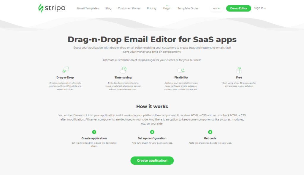
Creating email templates has never been easier than it is with Stripo’s all-in-one platform. After preparing your email template, it is easier to export it to your favorite Email Service Provider (ESP). Then, you may change it, add it to a campaign, and deliver it to your readers.
The best thing is that you will live stress-free in its delivery to your audience. The reason is that it’s an inbuilt testing tool that allows you to sample it in over ninety different common contexts, including several mobile devices.
You can also make dynamic AMP emails with their drag-and-drop AMP blocks, making it facile for non-tech individuals to enjoy emails with HTML templates.
Not only that, but it also gives you the ability to design your own modules, such as a structure with an image in the center or one with a headline, a photo, etc. After that, you can save these and combine and rearrange them within your templates.
In addition, you can incorporate interactive components into emails directly within the Stripo editor and select which components will be displayed and which will be hidden depending on the device. Even with these powerful features, you can effortlessly use them for your email design. This email design creator is intuitive and features a lot of aesthetic elements.
Chamaileon
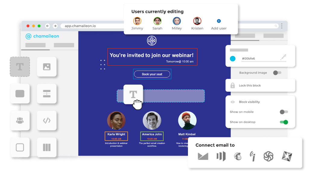
It’s the greatest choice for those who don’t know how to code because it allows them to construct emails without having to learn any code. With the HTML editor’s simple drag-and-drop interface, you can whip up professional-looking email marketing templates in no time. All major email clients support the HTML emails it creates, thanks to the email generator.
You may easily compose your emails using the several responsive templates provided and the many pre-made template blocks. The email’s content block can be moved wherever you like using the drag-and-drop editor, and then you can customize the text and color scheme as needed.
Also, you don’t need to avoid using only the pre-installed mobile-friendly and responsive email templates. The email template generator allows you to import HTML code that you have already worked on or that a coding script generated to create the best design for your email. After that, it will transform into a mobile-friendly email layout in a flash.
In addition, you can use Chamaileon in a team setting with multiple users. This way, you can share your workspace with your team and stakeholders and give them specific permissions based on their needs. You can assign an individual to the role of admin or viewer, depending on the contributions they make to the team. Educating other workers on how to use the platform will be simple because it is intuitive.
It also allows for simultaneous teamwork in email marketing. Others can watch in real time as you update your templates. The finest aspect is that no other email template maker has this capability like Chamaileon.
You can preview your email as it will appear in your subscriber’s inbox on their mobile device or computer before sending it.
Mailchimp
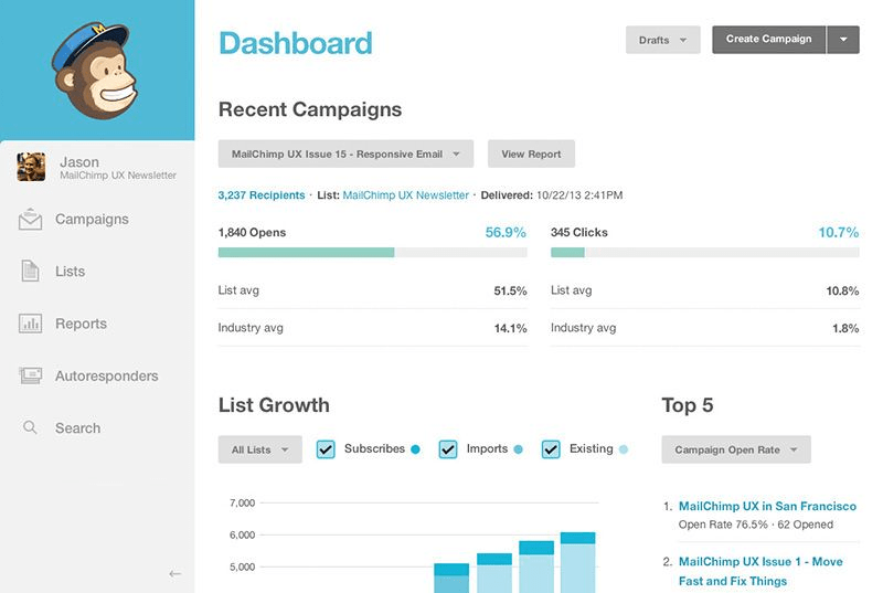
Mailchimp is an all-inclusive email marketing and design platform that prioritizes delivering full capabilities while maintaining exceptional user experience, particularly regarding email design.
MailChimp’s coolest feature is that you may choose between coding your email designs or using the program’s intuitive Drag and Drop editor. Using a featured template is a good idea if you have a clear aim. There are editable sections of content available in each of the templates.
This program works by combining the fundamental Drag-And-Drop feature with a null layout. This way, you get complete creative freedom over the look of your campaign. Choose from predefined theme categories, including newsletters, e-commerce, and more. You don’t need any prior knowledge of design to use it; it serves as a starting point.
In addition, you can access your previously made templates from the ‘Saved Templates’ section., you can change the existing template to suit your needs.
In addition, it provides you with many advanced options, like bringing the coding script that you design to another software. Plus, importing an HTML file offer you paramount control over your mobile-friendly email design.
While all features are useful, you can only make use of them up to a certain limit determined by your subscription budget.
Practices For Designing Responsive Emails For Mobile
At this stage, you will clearly understand mobile-first and responsive email designs and their importance in the corporate world. It is time that we highlight the best practices that will ease the email designing process for you.
A few mobile email design best practices will skyrocket the performance of your emails. You must have a strategy that you can implement to any email to make it clickable and convertible. We have enlisted those strategies as a quick tip to help you kick start your email marketing journey.
Your Subject Line Must Hook

The time you email someone, the first thing they notice and receive through a notification is your email’s heading or subject line. If it is of this much importance, why not turn it into the marvel of your creative mind? Therefore, it must be attractive and attention-grabbing.
The problem with the subject line is that you can’t just write it off. You must follow a set quantity of characters for your email title. If you exceed the words or characters, it will clip or hide under a few dots.
An effective title for your email for mobile displays must be succinct and engaging. The best hack is to create intrigue by leaving something out of the subject line. However, you must keep it simple enough that your readers can understand it effortlessly. If you want all of your characters to show up, try to restrict your subject line to about 30 characters.
For instance, you receive an email with the subject line, “Do you want to survive 2023?” At this moment, will you open the email? Chances are that many people will open because of the subject line that triggers curiosity and exploration of what can happen this year.
It also can make you find out the best techniques that you can use to improve your finances this year. So, most individuals will click on this email, increasing its engagement and click-thru rates.
Go Minimalist With Your Design

If you want your email to look well on a mobile device, simplify and tighten up the design. Mobile users will appreciate the minimalistic design’s ease of use and streamlined aesthetic.
You can make your email facile for the readers to read and understand with a few quick tips. For instance, use a single-column layout. If you choose a different layout style, the components will pile up, making the email unmanageably long.
Write your email with less-complicated language without compromising on losing its meaning or sense. Plus, the style of your email fonts plays a successful role in its appearance. Thus, write in a style that fits well with your audience’s choices.
Last but not least, try not to go crazy with the hues. Pick one dominant shade, reserving the others for infrequent use as accents.
Visuals Are Game-Changing

You should use restraint when including images in email messages. Attachments such as photos, movies, GIFs, etc., can significantly increase the file size of an email. This will cause the email to take longer to load, which may frustrate users on mobile devices.
You can fix the problem by strategically applying visuals and graphical elements. However, include them when you feel like they will strengthen your message and serve a larger goal. You can make sure the email design is up to par while still keeping the size down by focusing on quality rather than quantity.
Use Cta’s Wisely

One of the most important parts of every email is the call to action. Without calls to action (CTAs), your emails will cannot accomplish their intended goals. Perhaps you’re already aware of this.
However, creating email layouts that work well on mobile devices is challenging. For instance, mobile users may be less likely to engage with your calls to action (CTAs) if they are too small or in a hard-to-find area.
Therefore, we have gathered a few pointers for making interesting Calls-to-Action (CTAs) that display properly on mobile devices.
- You should stick to a minimum width and height of 44 pixels.
- It’s important to put the CTA in a visible location and give it enough white space around it so that it stands out.
- Increase your chances of conversion by including well-placed one or two calls to action.
Analyzing the market to understand how other businesses convert their customers is important.
Connect Your Emails To Mobile -First Websites
An email is the best approach for linking other websites for referrals or even sales pages. If you work on the best way to design an engaging mobile-friendly email, you may still confront problems like lack of engagement and unsubscribing of users from your email list.
The problem is not with your email but with the websites you link to. Suppose you get an email with a link you click, which takes longer. What will you do? Chances are that you will go back, delete the email, and kick out the email list from your ESP, right?
That can happen to you as well. Therefore, check the websites that you link to your emails before hitting the send button. It will bring positive changes to your email marketing campaign, making your emails mobile-friendly.
Avoid Congested Email
While it’s a good idea to include engaging content and eye-catching photos in your email, it’s also important to give the reader a break by leaving some white space. Use negative space if you want your emails to look good on mobile devices and keep your readers from getting sidetracked.
For instance, create a contrast with the help of white space between email texts and buttons. Doing so will signal the users to focus on the essential part of the email. This way, you will get sheet focus and attention, uplifting the chances of conversion.
Thus, keep the email’s spacing reasonable so the reader doesn’t miss any of the crucial details.
Restrict Your Email Length
Let’s ask a quick question: do you fully scroll through a lengthy yet informative post online? You may have done it once or twice, but you can’t do it every time, since it is daunting.
If your email’s vertical scroll is too long, your readers may abandon it without ever clicking the “Call to Action” button you’ve painstakingly placed at the bottom. Since mobile devices don’t have as much horizontal room as computers or tablets, email layouts on mobile devices have elements stacked on top of one another.
However, you can tackle the vertical length issue when you develop your email in a single-column layout. Include only three photographs in your email, conveying just one idea and using the correct dimensions for the images.
Test Your Email Before Hand
The key to success with your email is to bring it to life. Perfectionism may sound fancy, but it can take much of your time with no extra benefits. Therefore, if you design an email, it is imperative that you test it by sending it to your friends or trying A/B testing. Sending it to your friends will provide you with feedback, making room for improvements.
A/B testing is the best way to check your email’s performance to bring positive future changes. This method is effective in improving your email design and performance.
To perform this test, you must make two different versions of the same email that you have created for mobile or another device. Then, you will send both emails to your subscribers and constantly note the analytics of both emails. Also, you will note the differences in both versions, such as the position of CTAs, graphics, etc.
Thus, you will develop an actionable and practical strategy that you can employ for future email campaigns.
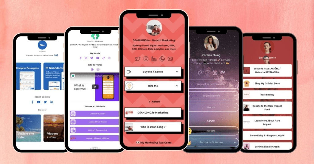
Best Examples Of Mobile Email Designs
The strategies that we discussed are actionable and practical. You may receive dozens of emails every day. You can examine those emails to find out which one triggers you the most. Then, analyze the factors of that email and note them down. This way, you can develop your own strategy for better emails.
However, we have enlisted a few examples. We found them the best in terms of visuals, CTAs, subject lines, etc. Let’s have a brief case study of them.
Burberry
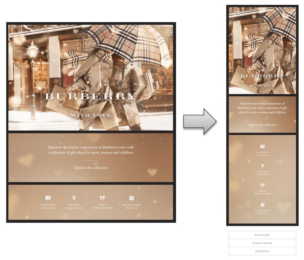
Burberry is a brand that sells men, women, and children’s wardrobe collections. We got this email that thrilled us with amazing visuals and a minimalist approach to the content. You can see the details that the designer has placed perfectly in this minimalist email design.
The first thing is the dual display of the email that perfectly synchronizes with each other. On the left is the desktop version, and on the right one is the mobile version of the same email. Now, you can find out exactly the same details in both versions, making it a responsive and mobile-friendly email. So, regardless of your device, you will experience the best with this email.
Another excellent feature is the icons that are visually attractive and say a lot without the use of text. Plus, the email is not congested, leaving ample space to make it easier to understand and read.
Netflix

Netflix is the leading digital streaming platform with an uncountable quantity of movies, web series, documentaries, animations, etc. Like its performance as a streaming platform, it has the best email marketing strategy. We got an email from Netflix with a suggestion for a web series.
Here, you can see the minimalistic and aesthetic approach of the text and graphics. The contrasting colors, such as red, black, and white, make it perfect for reading. The email has every relevant detail of the TV series without making the email congested with extra texts.
The best thing is the perfect placement for CTAs. With choices, you will definitely click on any of them, leading you to the Netflix website. Thus, it is the best example of a mobile-friendly email design.
Udemy


Udemy is the aesthetic platform for online learners with the availability of many skills. It has many courses that they try to promote and market to the people. Thus, email marketing is their best approach to it.
Recently, we got this email from Udemy about the recent year and our experience as instructors and learners. Meanwhile, these details don’t count for any good, but we will examine the factors of this email that make it the best mobile-friendly email. Let’s have a look:
The first thing is the aesthetic appearance of the email. You can see various colors, well-placed in the entire email. The email is short with limited vertical scroll. It makes this email easier to digest and understand. The font style is minimalist, with bold text to make a differentiated experience.
Last, the well-placed CTA will take you to the target page of Udemy’s website. Therefore, this email from Udemy is the best mobile-friendly email that works on every mobile device.
Summing Up
Email marketing is the best source of lead generation for any business. Without a well-balanced and actionable email, your marketing campaigns are incomplete and ineffective. However, you can get the most out of your marketing when you go for mobile-friendly emails. The reason is the abundance of smartphones in circulation.
We have discussed a few tactics that will make emails perfect for mobile devices. Here’s a quick recap:
- Subject line matters; make them crispier
- Use visuals wisely and minimally
- Add mobile-friendly links to your email
- Define your target audience and customize your email to meet their needs
- Try to test your emails for future improvements

Customer Communication Psychology: How Perception Shapes Every Message
This blog breaks down the psychology behind whitespace, F-shaped reading patterns, format choices, a

Best AI Contract Generators 2026: Business Automation Tools for Effortless Contract Creation
This blog offers a complete guide to the best AI contract generators of 2025, covering how smoothly

5 Ways Content Localization Improves Global Customer Experience
When entering new markets, what sets a brand apart? Localization. To ensure a successful market entr